typography
April Fools!
04/01/10 08:07 Filed in: silliness
Best
April Fools list selection from the
Museum of Hoaxes:
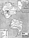
#5: San Serriffe 1977: The British newspaper The Guardian published a special seven-page supplement devoted to San Serriffe, a small republic said to consist of several semi-colon-shaped islands located in the Indian Ocean. A series of articles affectionately described the geography and culture of this obscure nation. Its two main islands were named Upper Caisse and Lower Caisse. Its capital was Bodoni, and its leader was General Pica. The Guardian's phones rang all day as readers sought more information about the idyllic holiday spot. Only a few noticed that everything about the island was named after printer's terminology. The success of this hoax is widely credited with launching the enthusiasm for April Foolery that gripped the British tabloids in subsequent decades.
#5: San Serriffe 1977: The British newspaper The Guardian published a special seven-page supplement devoted to San Serriffe, a small republic said to consist of several semi-colon-shaped islands located in the Indian Ocean. A series of articles affectionately described the geography and culture of this obscure nation. Its two main islands were named Upper Caisse and Lower Caisse. Its capital was Bodoni, and its leader was General Pica. The Guardian's phones rang all day as readers sought more information about the idyllic holiday spot. Only a few noticed that everything about the island was named after printer's terminology. The success of this hoax is widely credited with launching the enthusiasm for April Foolery that gripped the British tabloids in subsequent decades.
Being overly sensitive to typography is like having an allergy
11/18/09 10:20 Filed in: miscellany
“I think
sometimes that being overly type-sensitive is like an
allergy,” said Michael Bierut, a partner in the
Pentagram design group in New York. “My font
nerdiness makes me have bad reactions to things that
spoil otherwise pleasant moments.” One of his (least)
favorite examples is the Cooper Black typeface on the
Mass sign outside a beautifully restored 1885
Carpenter Gothic church near his weekend home in Cape
May Point, New Jersey. “Cooper Black is a perfectly
good font, but in my mind it is a fat, happy font
associated with the logo for the ‘National Lampoon,’
the sleeve of the Beach Boys’ ‘Pet Sounds’ album and
discount retailers up and down the U.S.,” Mr. Bierut
explained. “I wouldn’t choose it as a font for St.
Agnes Church even as a joke. Every time I go by, my
vacation is, for a moment, ruined.”
Find out how bad Mad Men has been doing with historically-accurate fonts.... in the NYT
Find out how bad Mad Men has been doing with historically-accurate fonts.... in the NYT
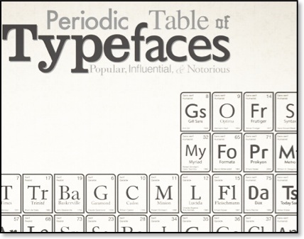
Periodic table of typefaces
11/14/09 10:14 Filed in: miscellany